Sunday, 11 May 2008
Drawing portrait by using Photoshop !!!
Accidentally, I found these videos on youtube, all of them are drawn in photoshop. They look exactly the same with drawing by pencil. The only difference is drawing on computer is absolutely harder and takes more time. Wish that I could draw some thing brilliant like one of these some day...... TT_TT
My font ads for A2C

Here is my font ads for my assignment A2C . I used garageband to compose the music but I think it is not very suitable . I spent hours to find another one which is more suitable but I couldn't. As a result, I decided to leave it like that :D
At the moment, I don't know how to upload my flash directly on this blog. So, if you are interested in, you can download it here: http://unix.rmit.edu.vn/~s3153999/s3153999_A2C.swf
Sunday, 4 May 2008
Creating an artistic water color painting from a digital image!


Here is my work done by following the tutorial Easy Watercolor Painting Effect
from photoshopessentials.com
If you are inrested in, visit this link and try yourself :D http://www.photoshopessentials.com/photo-effects/watercolor-painting/
Note: Image used in this post is taken from a free image website: http://www.morguefile.com/archive/?display=202248&&sid=aff2a038ed7d557e373f4023aa5eb861&MORGUEFILE=15tn5gavace7eunm1pguhm6vs4
Create a Flash Slideshow with fad in and fad out effect
As we have to do two last flash assignments, I found this tutorial which is about creating a picture slideshow in flash. I think it is quite useful so I post it here for all of you who need it! :p
Sunday, 27 April 2008
My DVD Cover and DVD Label for A2C
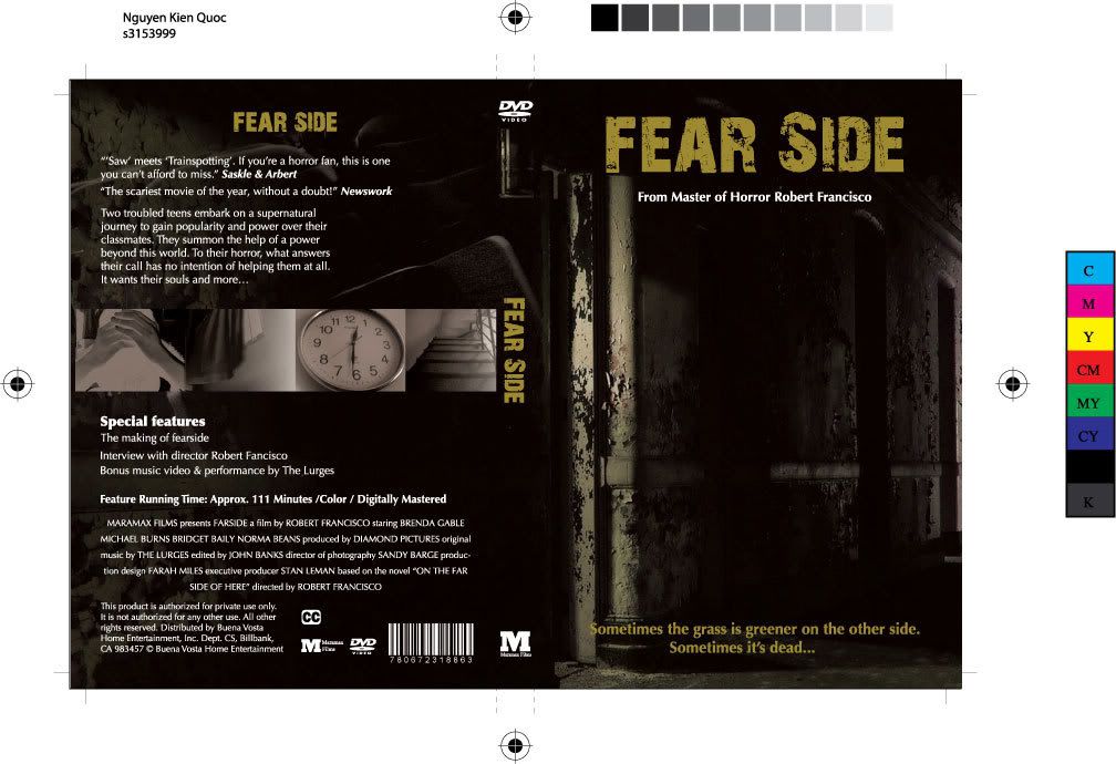
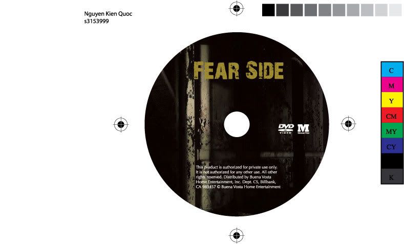
This is my DVD Cover and DVD Label I made for assignment 2C. Feel free to add comments if you have any ideas or thoughts about my design
My new yahoo emoticons collection


I use yahoo messenger everyday and see that my friends always use emotiocons such as : @_@, >"<, TT_TT, =.=! but yahoo does not border to design even one of them. As a result, I think: why don't I try to design these emoticons ? Finally, I have them. Enjoy and give me some comments if you are interested in :D
Sunday, 20 April 2008
Navigation bar for my new website

Here is the Navigation bar i use for my new website. It looks simple but actually it was not. I spent over one hour following the tutorial in order to complete it. Since I don't know how to upload flash on blogger, you can follow this link to view or download my navigation bar to your pc: http://unix.rmit.edu.vn/~s3153999/NavigationBar.swf
If you wonder how I did it, you can visit the tutorial website here: http://www.tutorialized.com/view/tutorial/Create-a-Drop-Down-Menu-in-Flash-Video/32913
My Portrait again :D

This picture was shot when I went out with my friend. I think it will be a good portrait if I play with it a little bit with photoshop. I want it to look more like a comic strip. I also intend to use this picture in my new website which I'm currently working on.
Sunday, 13 April 2008

Playing with Photosop

This photo was taken yesterday in the studio when I and my friend were having fun in the studio, taken some photographs. After that, I figured out that this photo can be changed into an art work. As a result, I decided to play around with photoshop and finally, here is my work!
Thursday, 3 April 2008
A tribute To Paul Rand
As I'm researching about Paul Rand, I found this video about Rand's works. They are really interesting, and nice designs. So, I post it here for all of you to have a see :D
Typography.


Here are my works about typography. Both of them are made in class when I was trying to play around with typography :D
Wednesday, 26 March 2008
Illusions in Advertising
I found these videos on youtube. They are quite interesting and funny. I especially like some of them (the bag with the picture of a girl is opening her mouth and some people hold it ). Here raises the question in these videos: At the end, they wrote "Many more illusions in advertising Gestalt:" I wondered is this gestalt or not? I think these advertisings are much more composited rather than gestalt. It's just my thought. If you have any different thougths, just leave a comment.
I Love Gaming

As I'm doing research about Paul Rand, I found out that his IBM (Eye Bee M) logo impressed me alot. As a result, I tried to express another concept with the same idea but in a more modern look!
The pupil and heart are my own work. I draw them in flash and export to photoshop to have some effects like shadow, gradient etc.
The game controller is a free image I downloaded on 123rf website (www.123rf.com).
Friday, 21 March 2008
A Welcome screen of flash site

Yesterday, I went to the studio to shoot some pictures of my friend for fun. After that, I had an idea to design an interface of a flash website, so I did it. I cut out my friend images out of the green screen. Then, I tried to fix the color of the images since it is so greenish but it seem doesn't work really well. Anyway, here is my design. If anyone who knows how to fix my issue, please tell me!
Collage

Image links:
http://bb-sgvn.rmit.edu.vn/webapps/portal/frameset.jsp?tab_id=_1_1
http://bb-sgvn.rmit.edu.vn/webapps/portal/frameset.jsp?tab_id=_1_1
http://www.morguefile.com/archive/?display=199474&
Saturday, 15 March 2008
Ideas for charity design
When attending Maddy's lecture this week, I was asked to think of 3 ideas that trigger my heart. These ideas could also be changed to design works for charity later. Here are my ideas:
My first idea is design a poster which encourage helping poor people. I got this idea when I watched the TV gameshows "vuot len chinh minh" & "ngoi nha mo uoc". In these shows, I could see that there are still alot of really poor people which really need help.
My second idea is design a poster that ask people to volunteer in teaching homeless kids. When I studied HED, I had a project which was about teaching English to homeless (or poor) kids. While teaching them, I realize that they have very hard condition of lifes. Kids in ordinary families can go to shool, so why can't poor or homeless kids can't ??
Finally, my third idea is to design a slogan and a poster that appeal people to act as a good citizen.
Nowadays, Vietnam is a country which attract many forigners. Beside, there are still many social evils, which make Vietnam somehow an unsafe place in some foreigner's thought. As a result, my design will have some effects in vietnamese's thoughts and will help vietnam to become a good place to travel for foreigners.
Gestalt

This is my gestalt design. In my design, I applied some gestalt theories inside.
Firstly, I rotated the picture to have the grass point to the word "SEX", which is the biggest word in the design ( I want this word to be dominant in my design). I also used another continual line to make viewers look down the words "of plants". I used the script font for these two words since I want it to looks more organic.
Saturday, 8 March 2008
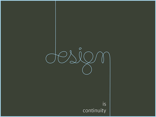
Analyzing a Design poster

Here is a design poster i found on flicker. Now, we'll take a look at it and analyze it a little bit.
First, This poster uses 2 fonts, one is script font and the other is a san serift font. The dominant object is the Design word, which is written in script font. Using script font here is ok because it's just a word. I think, another reason why the author chose script font cuz he wants to express his idea that design is flexible, hand made etc.
Second, the author use two lines. The right bottom line of the "n" letter gives viewers the continuance to look down at the word "is continuity" which really matches with his idea of putting the line there.
Third, this poster is symmetrical. If we put the word on the left or right hand side and put more things or elements on the poster , I think it will be more dynamic.
Reference: 'Design is continuity' Retrieved on March 08, 2008 from "http://farm1.static.flickr.com/97/247610222_460fa350b6.jpg?v=0"
A Crungy look

OK, here is the design of a crungy paper with my name on it. Actually, I followed a photoshop tutorial to design it . The background is 2 images of the buildings on the internet (they are free images!). The rests are things that I played around and created them :D
Reference:
http://www.morguefile.com/archive/?display=197793&
http://www.morguefile.com/archive/?display=197646&
Sunday, 2 March 2008
Sun and Moon
I had this idea when I sketched some ideas on paper yesterday. I use the pupils in man's and woman's eyes to express the sun and moon. I put the sun in the man's pupil because it can express man's characteristics: strong, hot temper etc. Also, the moon in the woman's pupil express the woman characteristic: charm, calm etc.
I used photoshop to make these images. At first , I intended to combine two of them to make a face but later, I think it will not work because i'm trying to express 2 different genders. As a result, I decided to leave them seperately.


Reference:
http://www.morguefile.com/archive/?display=129760&
http://www.morguefile.com/archive/?display=97411&
http://gimp-savvy.com/cgi-bin/img.cgi?nasaZBZYeKKZu061309
http://www.morguefile.com/archive/?display=194195&
Saturday, 1 March 2008
The lineart Tutorial
I found this tutorial on a graphic design blog. I think this is really useful for people who like to draw by hand but don't know how to trace their drawings on photoshop or illustrators. I myself also tried this. Although mine is not as good as the example in the tut, I at least know how to trace my drawings by photoshop or illustrator :D

And here is the tutorial:
Links: http://fc03.deviantart.com/fs10/f/2006/125/4/3/lineart_tutorial.gif
Subscribe to:
Comments (Atom)