
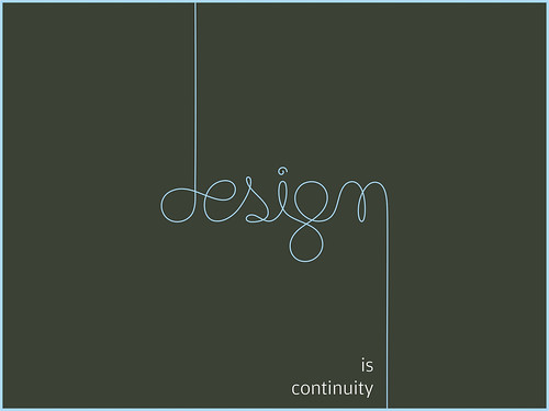
Here is a design poster i found on flicker. Now, we'll take a look at it and analyze it a little bit.
First, This poster uses 2 fonts, one is script font and the other is a san serift font. The dominant object is the Design word, which is written in script font. Using script font here is ok because it's just a word. I think, another reason why the author chose script font cuz he wants to express his idea that design is flexible, hand made etc.
Second, the author use two lines. The right bottom line of the "n" letter gives viewers the continuance to look down at the word "is continuity" which really matches with his idea of putting the line there.
Third, this poster is symmetrical. If we put the word on the left or right hand side and put more things or elements on the poster , I think it will be more dynamic.
Reference: 'Design is continuity' Retrieved on March 08, 2008 from "http://farm1.static.flickr.com/97/247610222_460fa350b6.jpg?v=0"
No comments:
Post a Comment